In Patch 3.3, we’re improving the landing screen to provide a smoother experience for all players. This includes a reorganization of some of the existing landing screen elements and new functionality that will help surface some of the most important updates.
A Chance for Further Improvements
We updated the landing screen experience with the launch of Legacy of the Void. While this improved landing screen offered benefits not present on the previous landing screen, over time we found ways to improve the way information is provided and organized. We saw 3.3 as the perfect opportunity to make these improvements.
First, we wanted to address how we surface new content. The current landing screen provides updates on a widget that rotates through each item. By rotating through each item on a timer, some updates remain hidden until manually clicked or until enough time has passed for them to surface. This functionality could cause some players to miss updates on new features or content. With our upcoming changes, we wanted to find a way to ensure all important information was immediately visible and accessible.
Another aspect we wanted to address was the organization of the landing screen when highlighting special announcements or events such as Balance Test Maps or new Commanders. During these announcements/events, we often change the landing screen background. As we used this feature more often, we found that experience wasn’t presented as well as it could be. We’re making some changes to ensure a cleaner and more intuitive layout than before, which will help during these themed “landing screen takeovers.”
Upcoming Changes
Reorganized Landing Screen Layout
The first and most noticeable change is the reorganization of the landing screen. We’re changing the layout in a way that helps us more easily call out new content and features.
Separating Content Types
We’re also changing how we present different content types by clearly distinguishing between the different ones we surface on the landing screen. This includes the following:
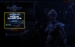
- New game content: This can include New Commanders, Co-op Mission Maps, and Nova Missions.
- Community news and events: This includes content such as Patch Notes, Blogs, or Esport events.
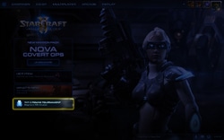
- In-game functionality and scheduling: This includes scheduling around both Automated Tournaments and other upcoming features.
Smarter Visual Hierarchy
The new layout will also change the size and prominence of the landing screen widgets. This will allow us more flexibility when looking to prioritize certain announcements over others and should help players quickly and easily recognize the most important announcements.
“What’s New” Slide-Out Panel
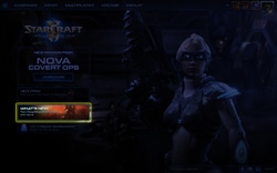
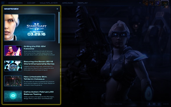
To further increase our ability to surface important information in impactful ways, we’ve added a slide-out panel to the landing screen that will provide information on new content. This will be an extension of the “What’s New” widget and will automatically be open when players log in for the first time after a major update.
Once the player has dismissed the screen, it will no longer be open by default until the next noteworthy update. Players will always have the option of opening this panel again at any time by clicking on the “What’s New” widget on the landing screen.
Panel Content
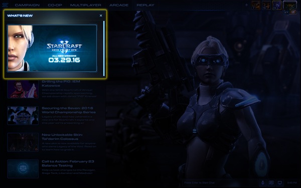
The large panel at the top signifies the biggest or most noteworthy current content item or announcement.
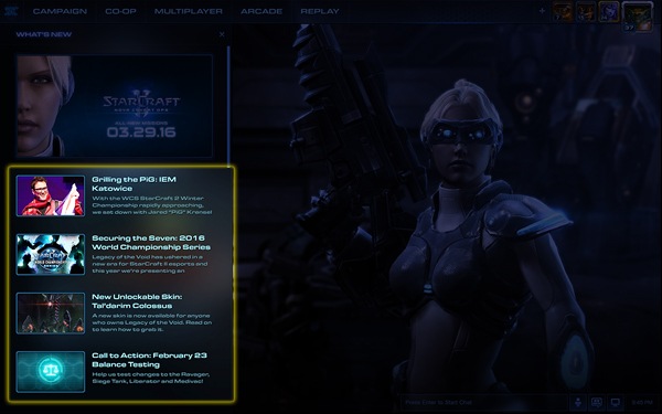
Below that you’ll find a list of up to five of the most recent updates or announcements. You can click on any of these items for more information.
We’re excited for the changes coming to Patch 3.3. This new landing screen experience should help players keep up with important updates and more easily locate information that will improve their play experience.

 April 27th, 2016
  Mark
Mark 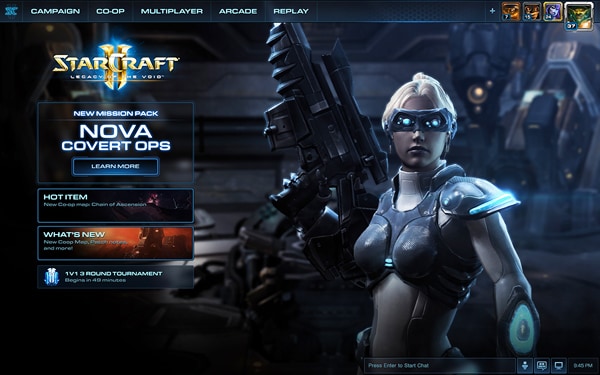
 Posted in